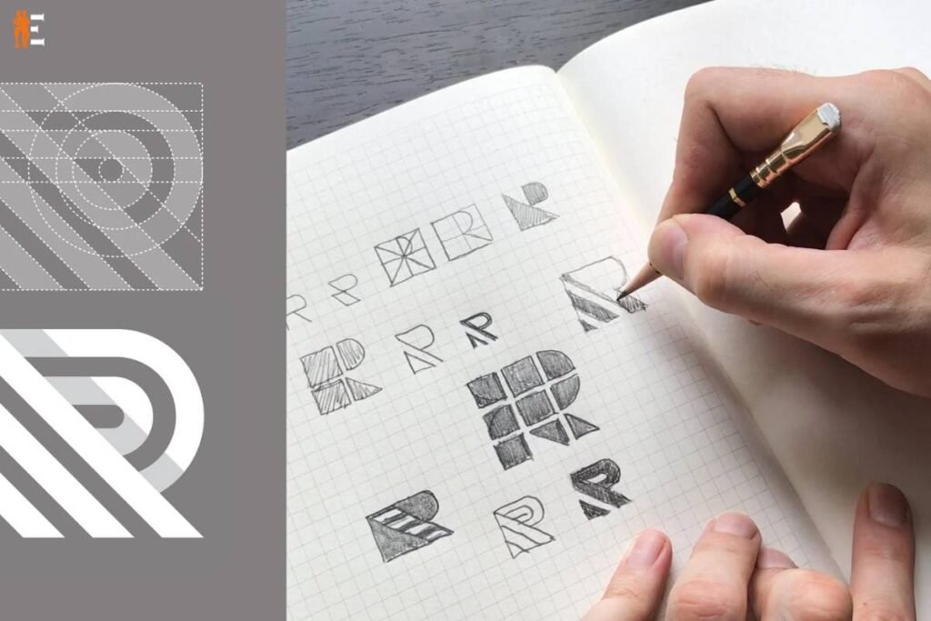
In the modern world, it is vital for a company to have an identity in order to be successful, and a logo is an integral part of that brand. Sometimes, the company’s logo is the very first thing a consumer notices and recalls about the business. Because of this, having a logo that is professionally developed is essential for making a good first impression and building a name for your company.
Yet, mistakes in logo design may have a negative impact on a company’s identification and, as a result, its ability to be successful in the marketplace. In this post, we will cover how to avoid making three frequent mistakes in logo design that may be detrimental to a company’s brand identification. These mistakes in logo design will be explored.
Here are 3 mistakes in logo design that can destroy your business identity:
Mistake #1: Creating a Complex Logo
Creating a complicated logo is one of the most typical mistakes in logo design. There is a common misconception that a more complex logo would be more stunning and remembered. However, this is not always the case in all circumstances. A complex logo may be difficult to see, particularly when it is shrunk in size, and it can be difficult to duplicate across other mediums, such as print, the web, or social media.
This is especially true when the logo is decreased in size. In addition, a complicated logo could not be as adaptable as a simpler one since it might not look nice on diverse backdrops or when colored differently. As a result, it is essential to maintain a straightforward and uncluttered style, using distinct lines and forms that are unmistakable and simple to commit to memory.
Solution: Keep it Simple
It is essential that the design be kept simple in order to prevent the creation of a complicated logo. A good logo should be immediately recognized and memorable, with a clear statement that represents the company’s values and purpose. A good logo should also reflect the company’s values and mission. The logo needs to be neat and simple to read, with a constrained palette and a set of typefaces to choose from. It is also necessary to evaluate how the logo will look in a variety of sizes and on a variety of backdrops. This is done to ensure that the logo is recognized and effective regardless of its size or placement.
Mistake #2: Copying Other Logos
The practice of replicating the designs of other companies’ logos is another typical mistake in logo design. Many companies operate on the false assumption that if a certain logo is effective for one firm, it will also be successful for them if they use it. Yet, imitating the design of another firm’s logo may be detrimental to a business’s identity since it can make the organization seem unoriginal, unprofessional, and even dishonest. In addition, replicating a firm’s logo might result in legal complications, since the original owner of the logo may pursue legal action against the company in question for violating the owner’s copyright.
Solution: Be Original
Being original and distinctive is really necessary if you want to steer clear of plagiarizing other companies’ emblems. A strong logo should be one that exemplifies the distinct identity, values, and purpose of the organization, and it should not be similar in any way to any other logo. It is essential to do research on different logos in the sector to check that the one you are designing is not too similar to any of the others. In addition, it is very necessary to collaborate with a skilled graphic designer who is capable of developing a unique logo that is adapted to meet the requirements and goals of the organization.
Mistake #3: Using Inappropriate Colors or Fonts
Another typical oversight in logo design is using colors or typefaces that aren’t suited for the project. Because of their ability to elicit a variety of feelings and communicate several meanings, colors, and typefaces are critical components in the process of developing a unique identity for a business. Yet, if a firm chooses the incorrect colors or typefaces, it may damage its brand identity and send the wrong message about its values and goal.
Solution: Choose Colors and Fonts Carefully
It is essential to exercise caution while making your selections in order to prevent the use of colors or fonts that are not acceptable. The identity of the firm, its core values, and its overall purpose should all be reflected in the colors and typefaces used in the design of a successful logo. For instance, a firm that specializes in technology would choose blue to communicate trust, dependability, and professionalism, while a company that specializes in fashion might use pink to communicate femininity, elegance, and refinement.

It is essential to use colors and typefaces that are complementary to one another in order to produce a pleasing overall design. Even when the logo is shrunk down to a smaller size, it is of the utmost importance to guarantee that the colors and typography remain readable and distinct.
BOTTOM LINE
Since a company’s logo is such an important part of its identification, poorly designed logos may be detrimental to a business’s prospects for success.
Three typical mistakes in logo design that may be detrimental to a company’s identification include designing an intricate logo, imitating the designs of other companies’ logos, and using colors and typefaces that are incorrect. To steer clear of these blunders, it is essential to maintain the design straightforward and uncomplicated, to be creative and distinctive, and to exercise caution while selecting colors and fonts. Working with a skilled graphic designer may be another helpful step in the process of developing a unique corporate logo that is suited to the requirements and goals of the business.
In the end, a successful logo should be immediately recognized, memorable, and reflective of the identity, values, and purpose of the firm it represents. It should be able to deliver the intended message without ambiguity and elicit favorable feelings and connections with the brand. By steering clear of these three typical blunders in logo design, a company will be able to create a powerful brand that distinguishes itself in the industry and draws in clients.